Friday, June 15, 2012

Yaira and the Dead City

Before I do a post on some  "fan art" paintings I've done, I thought I'd show you something a bit more recent. Infact, I finally finished it this week...

Yaira, 2012. Gouache and colored pencils.


Yaira is a character from my online graphic novel "Heaven and the Dead City"
( http://www.co2comics.com/pages/co2_heaven_and_the_dead_city.html ).


This will hopefully be the cover of Volume Two and is meant to be a companion piece to the Volume One cover that features  the mysterious "gentleman-witch," Swamp. (below)


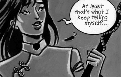
Yaira is a "runner" (aka, scavenger) for a small settlement outside the ruined walls of the Dead City.

She is an accomplished horsewoman and proficient with several weapons (preferrably anything pointy, but she can handle a lasso with a certain amount of flair...)


She gathers supplies, old medicine and the occasional forbidden book for her people, all the time trying to dodge the deadly guardian golems (called the Beserkers) left inside the city walls.  (She calls them 'Zerkers.)
And you thought your cockroaches were a problem...

For the cover painting of Yaira I first did a drawing in my sketchbook which I then photocopied at a larger size and transferred by lightbox to an 11"x 17" piece of vellum bristol paper (better surface for paints.)

I should say that the border was done separately on a sheet of tracing paper and added afterwards to the sketch. (I only drew half of the entire border and flipped it over on the lightbox so the other side would match in reverse.) I wanted Yaira's border to be sharper in contrast to Swamp's more rounded one to sort of reflect the shape of her arrows.

When I was happy with the finished sketch transferred to bristol paper, I made photocopies again so I could refer back to them when I started painting. (I also loosely painted one of the photocopies to see which colors I wanted to use.) So with the painted photocopy and one of the original sketches taped nearby, I then started work on the actual painting.

I wanted her painting to be in very warm colors (reds, golds and pinks) as opposed to Swamp's very weird, cold blues and greens.

The steps here to a finished illustration may seem like a lot, but this is how I seem to work best!


Tuesday, May 1, 2012

Faeries, Goddesses and Warrior Women

When in doubt, I always say, paint a faerie picture. Or a goddess. Or a warrior woman.

Before I do some posts about me and comics, I thought I'd share some more paintings I've done of Mythical Ladies...
Artemis, 1999. Gouache and blackboard chalk.


First, we'll start with a goddess. This was a portrait of  a friend of mine and fellow bookstore employee who wanted to pose as Artemis. (I took a reference photo of her in the breakroom of the bookstore holding a yardstick and a dowel rod as her bow and arrow. )

(Note the use again of blackboard chalk for the clouds and mist.)


Since posting this picture a few years ago online, I had a request for it to be used  as an illustration in a British pagan magazine for an article about Artemis.

I didn't get paid for it, but I got a year's subscription! Sweet.


Leaf Faery, 1998. Gouache.
You may have already seen some of my other faerie paintings from my previous posts. For awhile in the mid to late '90's, I was doing quite a lot of them...  I had more than enough ideas because of all the sketchbooks I'd compiled over the years.

This is my ubiquitous Leaf Faery. (Yes, I know, she probably combs her hair with a rake...)

She showed up in an earlier watercolor painting I did about autumn, standing in a wheat field and holding a basket of produce.

Her next appearance will be in the painting I started of the poet John Keats and his poem , "Ode to Autumn."


Here's the original rough drawing from my sketchbook that I transferred onto bristol paper (vellum surface) to also be painted in gouache.


Snow Faery, 2003. Gouache and colored pencils.
Green Faery, 1999. Gouache and colored pencils.


What you can't see very well in this photo of the Snow Faery is that the background is painted in silver metallic gouache which makes the snowflakes easier to see.

Photos never do gold or silver paint justice...


I purposefully put sprigs of wormwood in this faery's hair---one of the key ingredients in absinthe.

And that is quite an elusive shade of lipstick she's wearing...

She and the Snow Faery must buy makeup at the same goth shop.


                           Pine Faery, 2001. Gouache.


The Pine Faery I actually started on a canvas. In oils.  Well, water-soluble oils to be exact. I've always been impatient with oils--not only do they take forever to dry, they take forever to clean up, smell funny and I don't like the greasiness on my hands.
Being a true Water Sign, I thought maybe water-soluble oils would be the solution to my oil painting annoyances...

Nope. For me, at least, water and oil still don't mix and I grumpily started this painting all over again in good ol' reliable gouache.


Kitsune, 2004. Gouache and colored pencils.


Now onto a different type of  faery altogether...

This is a kitsune, a Japanese fox spirit.
They are supernatural foxes who can shapeshift, usually into the form of a desirable man or woman. Some live to cause havoc; some are benign and actually marry humans.

As the fox ages and grows in power and wisdom over the centuries, it grows additional tails. Eventually a one- thousand-year old fox will become completely white and have nine tails.


I have a fondness for foxes and love kitsune myths. I have many books about their Japanese and Chinese variations.

Samurai, 2002. Gouache,acrylic medium, colored pencils.
In staying with the Japanese theme, my local comic book store, Samurai Comics, had a wall of samurai artwork done by customers and some professionals.

I thought they needed a little Girl Power up there so I did this samurai woman.

This is one of the first pictures that I experimented with putting small drops of  acrylic medium in the gouache to make it waterproof. What was much better was my discovery that they actually make acrylic gouache in tubes and now I do a sort of  "underpainting" in the acrylic gouache (I use Holbein Acryla Gouache) and then paint and blend on top with my good ol' Windsor & Newton "regular" gouache.

But what led to my trying this out was actually painting the designs on her kimono!
By the way, the large kanji to her right means "samurai" and the smaller one beneath is "rain." (Or "Raine...")
Siren of Warsaw, 1998. Gouache.

The above mermaid, known as the Siren of Warsaw, guards the Vistula River in Poland and is sort of a Slavic Lady of the Lake. She's the emblem of the city of Warsaw, which my dad assures me is where my ancestors came from. (As well as Slovakia and what was once known as Prussia.)
The rim of the circle in this picture is painted in metallic gold (you can actually tell it's metallic in this picture as opposed to the Snow Faery's silver paint.)

I'm sure the guy to the right is probably waiting for just the right gust of wind...

(Oh, another note. People have asked me about this: If you've noticed I sign my name "Szramska"  rather than "Szramski", it's just that "Szramska" is the feminine version of my last name in Polish, as opposed to the masculine "Szramski" which is what I grew up with. Most Polish-Americans usually just use the masculine form, but I actually am more fond of the feminine version, which is what my grandmother grew up with.)


Owl Watch, 2009. Gouache, colored pencils.

I have about a dozen sketchbooks filled with fantasy pictures like this for "future paintings." Unfortunately, I'm not as fast a painter as I'd like to be (although I've been known to become quite energetic when someone promises me money if I can get it done in a weekend... Then I start making endless pots of coffee...)

But this one wasn't one of those, and infact was one in a stack of drawings I've had for years waiting to be painted. This one I finally got around to, and is bigger than most pictures I do (the average size I work is about 16"x 20"). I used the acrylic gouache "underpainting" I just talked about, with blended gouache and light colored pencil "glazing" on top.

Basically, I just wanted an excuse to paint a barn owl, my favorite type of owl. They have heart-shaped faces, sort of "toasted marshmallow" coloring and their eyes are dark, which is unlike the yellow eyes most other owls have. The woman in the picture, however, does have yellow eyes.

And finally our last picture for this post is one I did for my friend Kristin as a wedding present:


This idea was suggested by my sister, Victoria, because of Kris' love of dragons.


I don't think the dragon in this picture is meant to be her husband, but I could be wrong...


Coming up next: I will talk about some pictures I did of another kind of mythical people...


Monday, March 26, 2012

All This and Heaven and the Dead City...

   With a fixed determination
    Entered I each habitation,
    But they were all tenantless;
    All was utter loneliness,
    All was deathless desolation.
                              -- Christina Rossetti,
                                       "The Dead City"


Paint an ongoing webcomic comic by hand? Are you out of your freakin' MIND??

Yes, this is something I ask myself on a daily basis.

But still, here we have "Heaven and the Dead City" and it's something that's been about 25 years in the making.
The cover of the first volume of "Heaven and the Dead City",
 with title graphics by Bill Cucinotta.
 In 2010, an old friend named Bill Cucinotta contacted me and asked if I wanted to contribute a comic story to his and Gerry Giovinco's new and awesome online CO2 Comics.  ( http://www.co2comics.com/)  First off, I don't know how Bill found me since to all my former comic book cohorts from the early '90's, I may have well dropped off the face of the earth. But find me Bill did and he kindly asked if I had anything I might want to contribute.

"Well, there is this story I've been working on for awhile..." 

Understatement.

Even though Bill hadn't seen a single panel from this "story", he trusted me with producing serialized pages of it on a fairly regular basis. ("Fairly regular" I say because I've sometimes missed my own self-imposed deadlines for when the new pages should go up...)
And now the story is three chapters in and each new page I paint I'm learning as I go. I'm discovering what can be done with the gouache I use to paint it, how using darker outlines in certain cases are graphically better for emphasis, etc, etc. Nuts and bolts stuff. This has been "Heaven and the Dead City" for me and it is by far equally the most exciting and most demanding project I've ever attempted.

It didn't start off that way. Let's take the time machine back to 1982, Moore College of Art in Philadelphia when I was a student there. (Two years later I would transfer to Pratt Institute in New York.) We all had to keep sketchbooks and I remember how incredibly dull it was to practice drawing the everyday stuff around me. Even though it is  excellent practice to draw "mundane" stuff like still life arrangements, the view outside your dorm window, the car parked on the street, I would have none of that. I wanted to draw what interested me most. So...
I started to fill the sketchbooks with monsters, knights with swords, winged lions, fauns, faeries, angels, mermaids and castles...etc. And some dark mysterious guy in a frock coat.

 You get the picture.
Unfortunately, to my horror, we all had "Sketchbook Review" with the professors: they would take a look at what we'd all been drawing in our free time. When I showed one of my teachers, an elderly Russian man, these pages of epic geek-girl fantasy, I was surprised that he was actually delighted by it. "You're quite a romantic, aren't you?" he asked my embarrassed 20-year-old self.
So I learned two things in my freshman year of art school:
       1) I was still a Colossal Geek (albeit, a romantic one); and
       2) Always keep really embarrassing stuff in a separate sketchbook.

Which brings me to how what would someday be called "Heaven and the Dead City" came about. I started a "graphic novel" in said separate sketchbook, purely for my own entertainment. I had always been a habitual story writer as a teenager (kept drawers of "epics" I never showed another living soul. Yes, I still have them, as cringeworthy as they may be.),  but this was something new, based on the resurgence of my interest in comics in my twenties. I started hanging around comic shops in Philly and it rubbed off in my sketchbook. I brought this "story-sketchbook" to my classes with me and my first readers (besides my sister, Victoria, Swamp's biggest fan) were other students in the class who asked me daily if I had drawn new pages to read.

Without even thinking about why I was doing it, I started a story about a ruined city, a girl on horseback ... and a dark mysterious guy in a frock coat. (Well, what else? My favorite book was "Jane Eyre", after all.)
More recent sketch of Swamp.
He does "sinister" well.

The mysterious stranger needed a name. There was a creepy Talking Heads song on the radio a lot that year called "Swamp"  (the one with the growling refrain, "Hi, hi, hi, hi, hi, hi.") and it stuck to the mysterious stranger like glue. The girl on horseback was sort of a reverse Jane Eyre when meeting Mr. Rochester (she meets him while riding a horse, not the other way around), and her name would become Yaira. Along with the haunted Dead City that Yaira scavenges,  there was also another city far away, all bright and shiny... and corrupt. And full of even more characters with "special" abilities. And I went back and forth in my sketchbook between the characters in the two different cities until they finally converged and met each other. Plus there was magick, ghosts, monsters...and these weird whirligig things with eyeballs.
Sketch of Yaira for the painted
 cover of Volume 2 .

However, I told myself I wouldn't take drawing this story seriously until I learned how to draw perspective somewhat properly. There would be pages and pages of cityscapes that needed to look halfway convincing and when I started art school I didn't know the difference between one-point, two-point and three-point perspective. And how exactly did you find the horizon line, when you couldn't see the horizon? Pespective to me had once seemed scary and mechanical. Now --
Perspective is my friend and we hang out and have coffee together.

(The horizon line is always at the eye level of the viewer. These and other things about the wonderful world of perspective-drawing  I actually taught myself from books, the same way I taught myself how to paint... more-or-less... Though I'm no master of perspective now, I'm light years better than I was in college, to be sure.)

This was all pretty ambitious to be contained in just a sketchbook but I never actually thought about pulling it out of those pages for another two decades, though the story kept getting older with me and (hopefully) maturing. I began to seriously rework it right past the new millennium, convinced I was going to put it on "good paper" and make a proper comic book out of it. However, after September 11, the prospect of drawing a destroyed city was not very appealing to me and the project got shelved again. But I was far from giving up on it and it took a different turn as I wrote it a new beginning.

By the time Bill contacted me, I had three chapters started and about 70 pages of penciled art that I wasn't quite sure how to progress with. I didn't know a thing about digital art and I wasn't a particularly good inker (or so I told myself then)... should I try to paint the thing? With my old friend, gouache? How much work would that entail?

Well, a lot, I discovered. I was also handlettering it. But for me, there has always been something therapeutic about making a picture from start to finish by hand...A type of "Look what I made, Mom!" "Oh, neat, let's hang it on the refrigerator!" mindset.  Maybe it's also some sort of Arts and Crafts mentality that my archaic-minded brain gets into. I really just like shoving paint around with a brush. But I was up for the challenge to myself.

"Yeah, I'm gonna paint this baby!"

The decision to paint in black and white (or more accurately in shades of gray) came about due to my original plans to self-publish the story. It's always cheaper cost-wise to print in black and white. Also, had I added color as another element (other than in the cover) it would take me AGES to get anything done. So I tried for a gothic black and white movie effect.

As I worked and saw each subsequent page reproduced on CO2 Comics' website, I saw what I could do differently and what could use enhancement. I started to learn things about the medium I had chosen to work in and what things worked and what didn't. The more pages I produced and the  deeper I got into the project, I began to learn what I was actually capable of doing. With each new page I painted, I learned a new working method.

I had a very short and scattered comics "career" (not the word I was really looking for, but it'll do...) in the early 1990's and this is the subject of an upcoming post. I pulled away from comics as a storytelling medium out of frustration about the industry in general in those years. Things have changed a lot since then, but I had already retreated and went back to doing stories on my own, in private, only for me in my sketchbooks again-- and that's what "Heaven and the Dead City" is a product of, me trying to entertain myself. (Also much like the Pre-Raph cartoons I've started doing recently--see previous post...)

CO2 Comics gave me the scary and admittedly ambitious experiment in trying to take this long story out of my sketchbooks and into the new realm of  webcomics. So that's what we have here.  http://www.co2comics.com/pages/co2_heaven_and_the_dead_city.html  I will write future posts about the ongoing process, the story and the characters. And my own adventure in writing, drawing and painting a story I began when I was about 18 years old continues...

Monday, February 27, 2012

Pre-Raphernalia, Part 2: Revenge of the Sisterhood


I was very honored to be asked to do a cartoon of
Fanny Cornforth for the wonderful (and very funny)
Kirsty Walker for the revised edition of  her book,
"Stunner."


This past year has been a pretty rough one for me. While doing the odd illustration job over the years (and most of my illustration jobs are decidedly odd ) I've held a steady day-job at Borders for 17 years. Yup, that long. Borders at the beginning was a great place for creative types to work and have health insurance and steady paychecks...

Unfortunately that all changed and we all know what happened to Borders as a company.


And we can't say we didn't see it coming. And no, it isn't because people don't like books anymore. But I'll keep that rant for other another forum.


I was fortunate enough to find a new job at a used book store (soooo much better) and a smaller apartment for less rent. As I continued to do my usual color paintings and my webcomic, "Heaven and the Dead City"  http://www.co2comics.com/pages/co2_heaven_and_the_dead_city.html  (shameless plug and the subject of a future post) I was in desperate need of some silliness after the stress and upheaval of  the past year.  My recreational activities usually involve drawing in my sketchbook-- stuff that only I will see and would be too embarrassed to show anyone else.

The Pre-Raph Cartoons nearly stayed there if not for the prodding of some curious friends (you know who you are) who I worked with at Borders who were also Pre-Raphael-philes. (Um... is that even a word? Oh, who cares.) Anyway.  They asked me to put them up on Facebook and we all got a few chuckles.

Then the awesome Grace Nuth saw them and this happened. http://thebeautifulnecessity.blogspot.com/2011/08/this-will-make-your-day.html

Over the past year, I had been a fan of and was rapturously reading many Pre-Raphaelite blogs online (many you will find in the upper right column of this blog). Lurking is probably a better word, since I was too shy most of the time to get involved in the topics and conversations. One of my favorites was Grace Nuth's The Beautiful Necessity     http://thebeautifulnecessity.blogspot.com/  because, among other lovely things devoted to the Pre-Raph world, it was so "Topsy-and-Ned" oriented (and we all know I have a fondness for these two guys.)


Maybe it was an omen of things to come, but I friended Grace on Edward Burne-Jones' birthday. The response to these ridiculous pencil drawings was overwhelming (Grace, being VERY cool, has a LOT of readers) and I couldn't remain a shy lurker anymore. Thank goodness.

One of the things I've always missed about being in college was being around people with similar interests to talk about the things we all liked--- be it art, movies, music, whatever. You had no trouble finding a kindred spirit somewhere. I joined a comic book club in college (I was the only female--a good and bad thing, I suppose) and met a lot of creative geeks like myself. Later, when I hung around people who actively worked in the comic book industry in the early '90's, there was a similar vibe. A type of community of like minds.

Working at a bookstore was the closest thing I could come to the sort of environment that I sorely missed. However, by putting up the cartoons on the Internet and having people actually see them and enjoy them brought me in touch with a lot of new friends who liked the same sort of things I did. We could share pictures and stories and have conversations and discussions... And after feeling artistically isolated, I feel like I'm part of a creative community again.

Maybe even.... A Sisterhood. (Granted, this Sisterhood also includes Brothers.)


I was especially taken by the concept of a Pre-Raphaelite Sisterhood and especially Stephanie Pina's wonderful website and FB page. http://preraphaelitesisterhood.com/  The focus was on the ladies. And it was about time.

The ladies involved with the Pre-Raphaelite movement often were (understandably) very frustrated-- Victorian England wasn't an easy place for a woman, especially if she had any artistic or "bohemian" leanings. Maybe that's why I started drawing the Pre-Raph cartoons, to have fun with everyone (male and female) trying to get out of their stodgy restrictions.What would happen if they talked with one another in a 21st Century way?


I always like to tell the story of how I drew the following cartoon during a blackout during this past summer... by candlelight. How goth.


I had read that Lizzie Siddal and Georgie Burne-Jones had wanted to collaborate on a book of fairy tales and this tragically never happened due to Lizzie's death. However, I wished it had happened as it might have begun a true Pre-Raphaelite Sisterhood, in which the Pre-Raphaelite women collaborated with each other on projects not unlike what their husbands, brothers and lovers were doing in the PRB.

In recent years there has been a surge of women creators in the comic book industry (as well as best-selling female characters) but it wasn't too long ago when a woman in comics would hear the frequent phrase, "Chick books don't sell." And that was the basis for this cartoon. (Plus my friend Stefan wanted to see Christina Rossetti as Gabriel's moody "goth" sister.)

(In reality, however, Rossetti was actually very supportive of female artists--maybe a little too supportive. His mentor, Ford Madox Brown, actively taught female students who were otherwise shunned by the male-dominated art academies.)
Not Ford Madox Brown giving a lesson to a student, but dastardly Charles Augustus Howell
and his talented mistress who painted forgeries. It happened, but not quite this way.

But I'm having so much fun doing these cartoons that I have recently begun to transfer them from my sketchbooks onto good paper, clean them up and ink them ("inking" for me involves Pigma pens and acrylic gouache) so that they might hopefully be compiled into a book. It's a slow process (and one of several projects I have going), but in the mean time I'm still drawing new cartoons in my sketchbook during my lunchbreaks to post online.

I'm especially thankful to the friends who encouraged me to show these sketches and for all the new friends I've met because of them.
And thank you, Pre-Raphs, for just being you.


Thursday, February 9, 2012

Pre-Raphernalia

     I honestly don't know why I started drawing  Pre-Raphaelite cartoons...

A cartoon of William Morris and Edward
Burne-Jones, from my sketchbook.


...only it seemed like a fun thing to do at the time, considering that I was reading about them on my lunchbreaks in the bookstore where I work. But I've had a pretty long fascination with these men and women....

Topsy and Ned "inked" with acrylic gouache.


It's no secret to anyone who knows me that I love the Pre-Raphaelites. I was always drawn to the romance and color and beauty of this period of 19th Century art. Here I could find  depictions of myths and chivalry... or just paintings entirely devoted to a single ethereal woman in what looked to me like fairy tale garb.


Having worked at various bookstores over an 18 year period, naturally I relished the employee discount which helped lead to the accumulation of these:
My Pre-Raphaelite library.

But wait! There's more!
 
This also includes Pre-Raph-inspired novels as well. And there's still more than this and it
continues to grow as we speak...

Fred Stephens by William Holman Hunt. (1847)
I've had a crush on this painting for
I don't know how long...

So naturally when I had an opportunity to finally go to London, one of my destinations was the Tate Gallery. Unfortunately for me that year, the Tate had chosen to undergo renovations and the Pre-Raphaelite exhibit was on loan or on tour. There was a lot of construction work and what seemed like endless rooms of Turner. No offense to Turner, who I do like, but he was not who I'd come to see.
Millais' "Ophelia" wasn't there, there was no
Rossetti or Burne-Jones or Holman Hunt...
And possibly worst of all--

There was no painting of FRED!!


But thank God they left this one for me to see...

The Lady of Shalott (1888), by JW Waterhouse.

I've had a framed print of this on the wall of my apartment for years, so naturally I always thought this painting was considerably smaller. My friend Donna Dietrich took a picture of me standing next to it  

and you can see how big it actually is. (For the record, I'm on the short side...)

Seeing this magnificent painting helped make up for the disappointment I felt for not being able to see the other Pre-Raphaelite paintings I had only seen in my books. So I bought a "Lady of Shalott" fridge magnet, looked at a lot of Turner and moved on.

Thank goodness for the Victoria and Albert Museum.

We visited the V&A the day before we had to fly back to Philadelphia. And it was here I finally came face-to-canvas with one of my heroes, Edward Burne-Jones, for the very first time.

Sir Edward Burne-Jones standing infront of the world's
 largest gouache painting, "The Star of Bethlehem".
(This particular painting is in Birmingham
 and hopefully someday I'll get to see it...)

First off, I want to mention that I'd been having some artist's block before the vacation. I was still struggling to teach myself how to paint in gouache and I had a painting of a mermaid at home on my drawing table that I was convinced was the worst thing I had ever done. I had brought my sketchbook with me to London, but despite seeing a wealth of things to draw and having plenty of time to draw them, I only did a halfhearted sketch of Trafalgar Square and some pigeons and then never drew another thing on the trip.
                          
At the V&A, I encountered the biggest watercolor/gouache paintings I had ever seen, which I at first mistook for oils. (Unfortunately for poor Ned Burne-Jones, someone trying to clean one of his paintings in Paris made the same mistake and wiped away a year's worth of work.)

But here was someone painting on very large scale with a medium that I was becoming very fond of. But it got better... in a glass case in one of the rooms was...

The Sketchbook.


Ned Burne-Jones' sketchbook, to be precise, opened to some random pages. I stared at it in fascination because it was very loose, very unpolished, playful and serious at the same time. I think I loved it for its imperfection. It wasn't as intimidating as those huge, beautiful gouache paintings of his. It was the shot of inspiration I was looking for.
 
When I finally went back home to my mermaid painting, I decided it wasn't really so bad after all.    

Winged Mermaid, 1998. Gouache with chalk
and colored pencils.
Something else I've always done (privately), was draw cartoons. Maybe my childhood years of reading Mad Magazine and the movie parodies rubbed off on me. As a little girl, I drew my OWN versions of movies or tv shows I had seen.

All this was before I properly discovered comic books... but that's another story.

But one thing led to another through the years and I began to like storytelling with word balloons. And sometimes the sillier the better.

Topsy and Ned compare sketches,
from my sketchbook.

Fred Stephens, the only male "stunner",
also another sketchbook cartoon.
So it was to my delight when I discovered the Pre-Raphaelites themselves drew cartoons of themselves and each other. Here are only some:

                                                        Dante Gabriel Rossetti

A young Millais and (beardless) Hunt express their opinion of  the Royal Academy's taste in art.


Jane Morris and Rossetti's pet wombat named
 Top after Jane's husband, William Morris.


Rossetti mourning the death of Top the Wombat.


Gabriel's sister, Christina Rossetti, responding unfavorably to a review of her poetry.


                                                     John Everett Millais
An overly windy day in Scotland with a bemused Scotsman fishing in the background.

Effie Gray, (who was married to famous art critic
John Ruskin at the time) giving Millais a
haircut after he banged himself up in
a swimming accident that day.

Edward Burne Jones


The artist has found some extra enthusiasm for working.


Ned nods off while Morris recites one of his epic poems.

Burne-Jones did quite a number of silly cartoons of his friend William Morris.

One of the many cartoons in the series
"Morris Gets Plastered."


Morris goes to Iceland--as Ned imagines it.


Coming up next: My own Pre-Raph cartoons and how Grace Nuth exposed them to EVERYONE. (Ahhhhhhh!!!!!)